Fonts are very important to bring a story or feeling to life. Every font has his own properties and can tell his own story. I've done research in the South-East of Amsterdam, where I was living for a while, to find out what font would be typical for that specific part of the city.
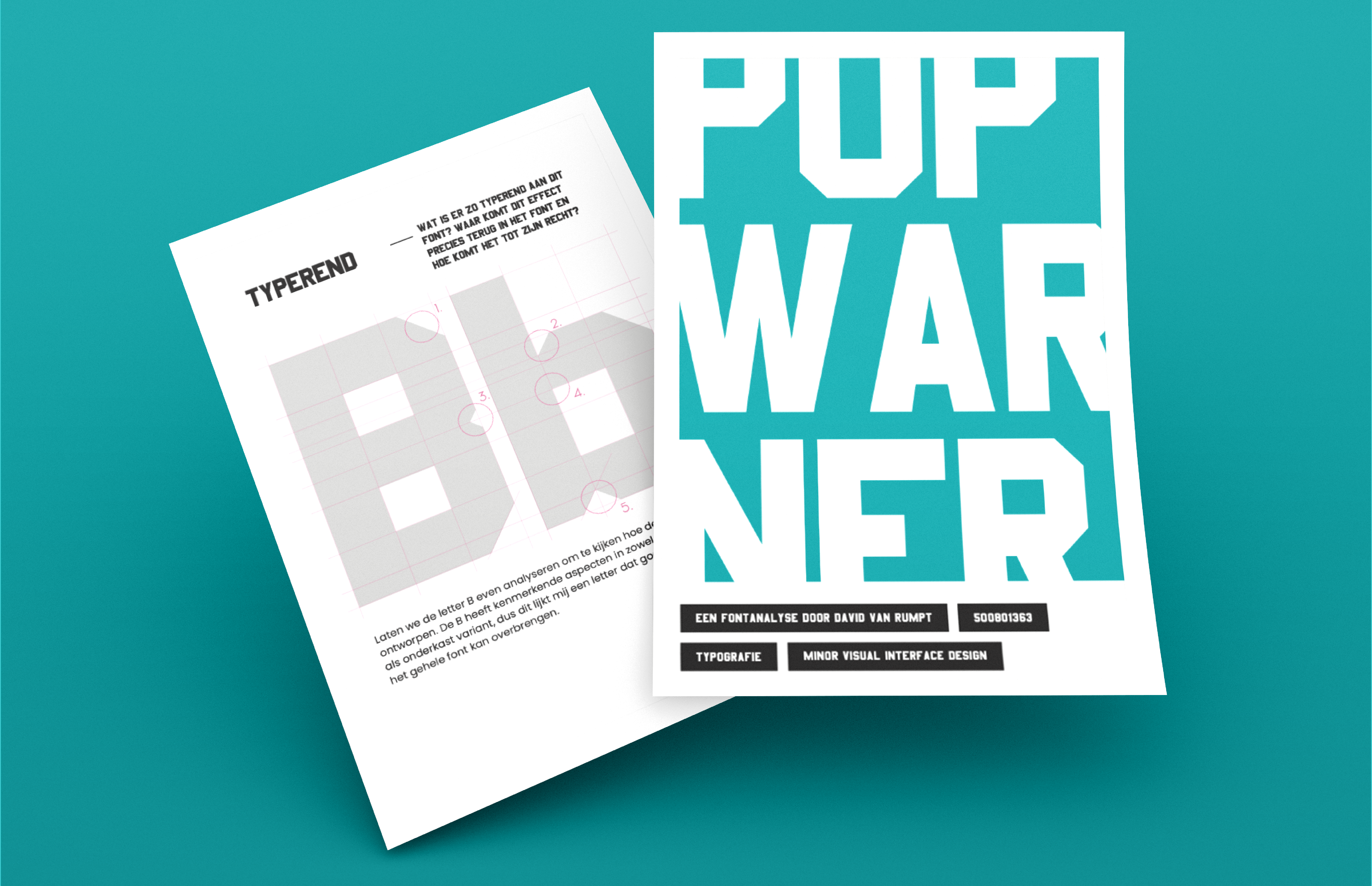
I'm really proud of the fonttype that I've made because it really fits by the condition and living style of this part of Amsterdam. It was very interesting to go on the streets and only looking for fonttypes. Also, analysing the Pop Warner font was very interesting. Finding out that some of the letters where not even visualised in the specific fontstyle. By clicking on "watch project" you can read my whole font analysis.
Used software: Indesign, Illustrator,
Watch Project